The logo consists of the abbreviation of the program “REDD +” with the addition of the country name, Suriname. This indicates that it is the national program of the Republic of Suriname.
Green is chosen as the color of the logo, since the program is about preservation and responsible use of our nature. The red color indicates our passion and the need for action. The logo mark has the form of a leaf containing footprints from both a human and frog. This represents the unity between the animal kingdom and people, who are connected through nature.
We are the forest because the forest is in us. We discover every day in the forest, we live from and in the forest, in short, we are the forest.
The dotted line through the letters stands for irresponsible use of the forest: it affects us personally. The dotted line is getting thinner, aiming at the elimination of irresponsible practices.
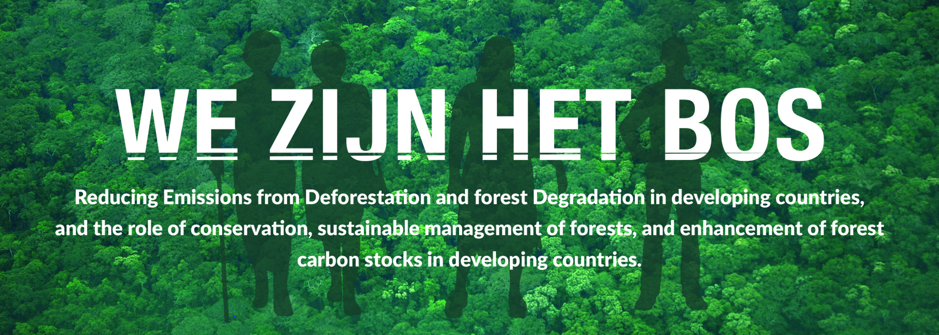
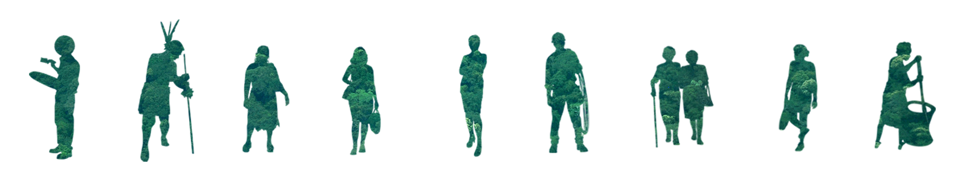
The silhouettes symbolize the people of Suriname, representing the different target groups of the REDD+ program, such as the Indigenous and Tribal communities, women, children, elderly, etc. In other words, each and every citizen of Suriname is targeted, as REDD+ is a national program with national impacts.
The silhouettes have the same color texture as the forest, symbolizing the slogan ´We are the forest´, and ´the forest is us'. The people of Suriname are undeniably connected to the forest, since the forest covers more than 90% of Suriname´s land. We should treasure these forests, as they are part of our identity, and part of who we are.


Follow us on social media